Edit Content

FAT FROG

Branding & Design Studio
Fatfrog Logo Gif

Fat Frog Branding & Design Studio, We specialize in crafting unique, high-quality packaging solutions that not only Safeguard your products but also enhance your brand’s identity.

KP ARCHITECT

Rebranding, Brand Identity Design, Brand Guidlines, Brand Strategy, Communication Creative Design


Transforming Visions into Bold New Identities

Rebranding is about more than just a makeover, it’s about redefining your visual identity, messaging, and strategy to align with your evolving goals, values, and audience. Every brand has a unique story, and when it’s time for a new chapter, we help you write it. At KP Architects, we don’t just update your look; we transform the entire experience, crafting a stronger, fresher, and more relevant brand identity that’s ready to make an impact.

Rebranding Importance

Rebranding is important for businesses aiming to evolve and adapt to changing markets. It signifies growth and innovation, helping you connect with your audience, attract new customers, and communicate your updated vision effectively. Embracing rebranding shows your commitment to progress and helps your business stand out in a competitive landscape.

Reflects Growth and Innovation

Rebranding aligns your brand’s message and identity when it no longer connects with your target audience or its purpose is unclear.

A refreshed brand identity opens doors to new demographics, broadening your customer base and ensuring long-term growth.

A strong, updated brand image can breathe new life into your business, enhancing its reputation and building trust.

Rebranding Process

Rebranding starts with assessing your current identity to identify improvement areas. A strategy is then created, focusing on updated goals, audience alignment, and core values. This includes refreshing visual elements and messaging, followed by a smooth rollout to ensure your brand reflects growth and connects with your audience.

461514136 933633642126820 284098568920218942 n 1
461413777 1074200867383960 901441175678999256 n 1
Artboard 28
Artboard 3 2
Artboard 2 2

KP ARCHITECTS REBRANDING

The current design lacks uniqueness and resembles other architectural logos, making it hard to stand out. It also fails to convey the firm’s distinctive identity and core values.

Strategy Statement

KP Architect’s brand strategy is to position itself as a visionary architectural firm that blends timeless design principles with innovative, sustainable solutions to shape inspiring and functional spaces. Our goal is to build a deep emotional and professional connection with clients, communities, and collaborators by consistently delivering thoughtful, detail-driven architectural experiences. Through a confident, refined, and future-oriented brand voice, KP Architect emphasizes creativity, precision, and purpose at every touchpoint. We aim to differentiate KP Architect by focusing on human-centric design, environmental responsibility, and architectural storytelling that transforms spaces into enduring legacies. Ultimately, KP Architect is not just about constructing buildings it is about crafting spaces that elevate everyday life and reflect the aspirations of those who inhabit them.

Key Challenge

One of the core challenges faced by KP Architect is establishing a distinctive design identity in a highly competitive and often trend-driven architectural landscape. While many firms focus on rapid delivery or aesthetic appeal alone, KP Architect is committed to balancing visionary creativity with functionality, sustainability, and contextual relevance a philosophy that requires shifting conventional client expectations about architecture as purely structural. Effectively communicating this integrated, purpose-driven design approach while maintaining trust and clarity across diverse client segments is a strategic challenge. Additionally, ensuring consistency in brand identity and experience across digital platforms, client interactions, project presentations, and built environments demands careful alignment and attention to detail. Overcoming these challenges is essential for KP Architect to be recognized not just as a service provider, but as a trusted design partner shaping meaningful, enduring spaces that reflect the values and aspirations of those they serve.

Logo Concept

Artboard 2 4
Artboard 13 1
Artboard 16
Artboard 17
Artboard 20

Colours Selection

Our Aim was to use the palace to represent the feeling of Modern, Minimal and Creativity. It’s a youthful hue that appeals to the young while also resonating with older generations who appreciate modernity and progress.

About the colour :We take orange colour as bold main colour, because it can evoke feelings of excitement and creativity

Artboard 19

Brand Implementation

Brand implementation is the process of bringing a brand’s strategy, identity, and messaging to life across all touchpoints ensuring that the brand is consistently represented and experienced in every interaction. For a successful implementation, it involves translating core brand values into visual elements, tone of voice, customer experiences, and internal culture. This includes deploying the logo, color palette, typography, and imagery across marketing materials, digital platforms, packaging, signage, and environments. It also extends to training internal teams, aligning workflows, and establishing brand guidelines to maintain coherence and clarity.

Artboard 27

Implementation

At KP Architects, we integrate innovative design with real estate expertise to create inspiring and enduring spaces. Committed to excellence, we develop tailored architectural solutions and sustainable projects that enhance value while aligning with our client’s vision and market demands.

BRAND IDENTITY

Artboard 13 copy

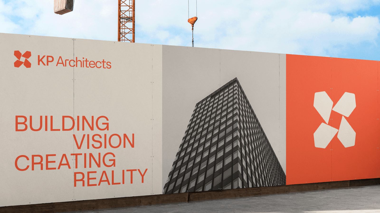
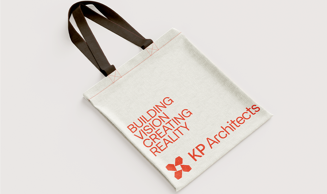
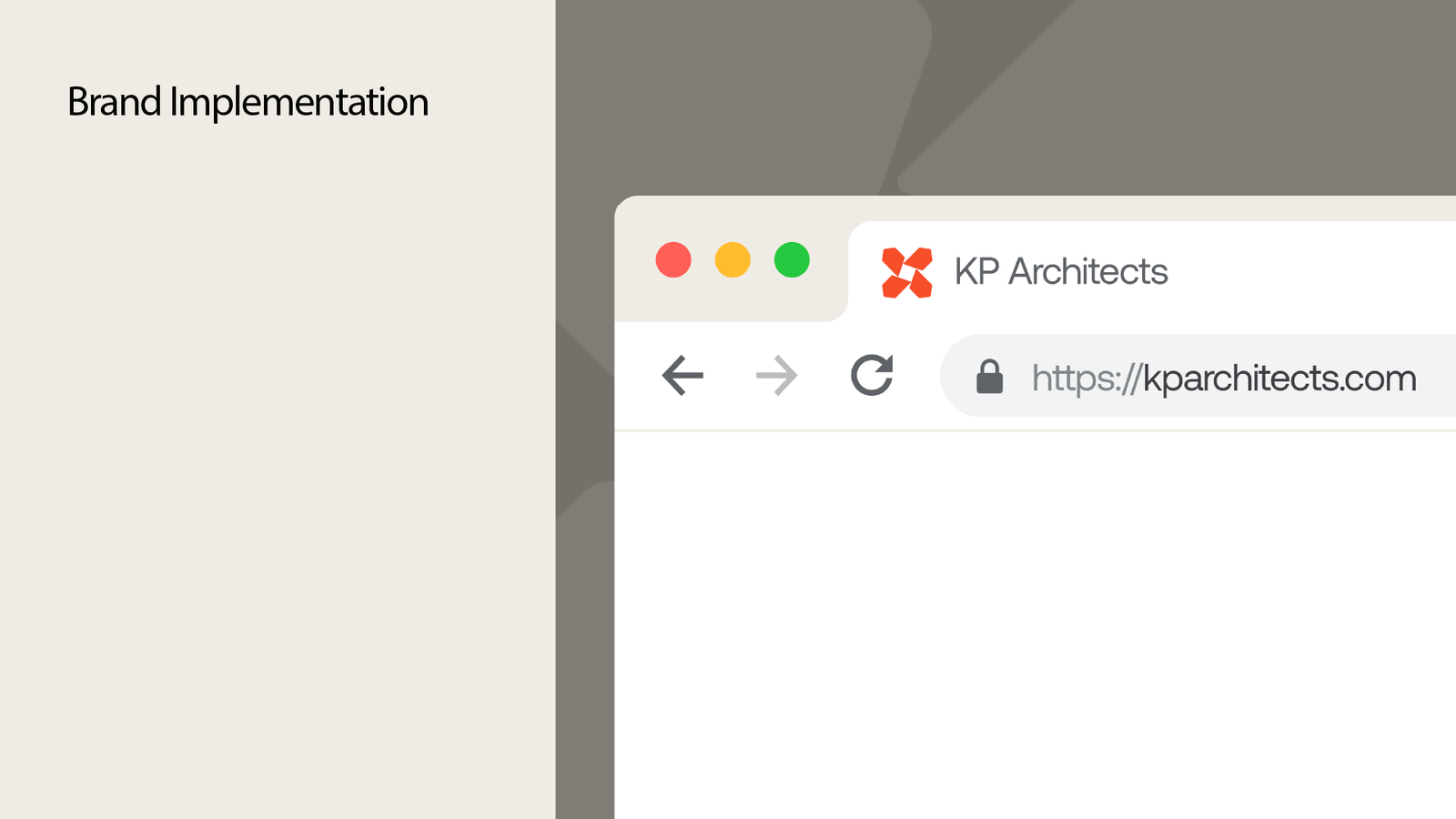
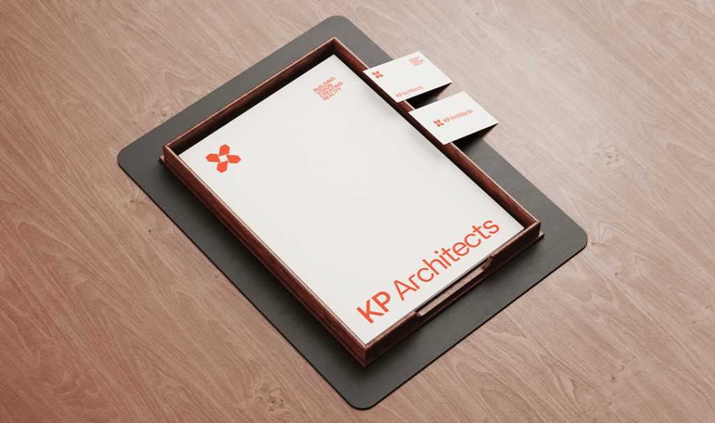
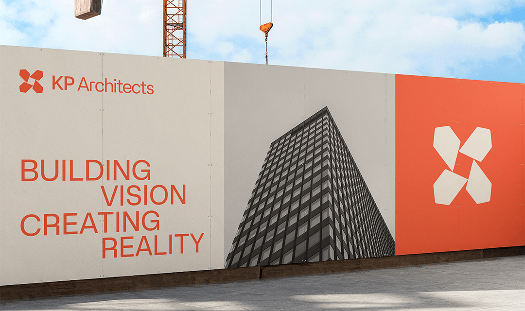
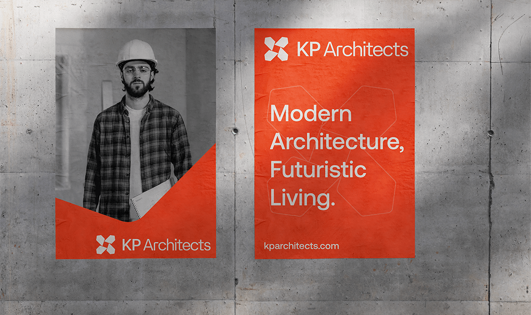
At KP Architects, our brand identity is rooted in a passion for design, a commitment to excellence, and a vision to shape the future of spaces. We are more than architects; we are storytellers, crafting experiences through innovative and purposeful designs.

Screenshot 19 1
Screenshot 18 1

KP ARCHITECT

architect 1
Artboard 3 copy 2 1
Artboard 2 2

Our Core Values

Creativity: We thrive on pushing boundaries and bringing imaginative ideas to life.

Integrity: Transparency and trust are at the heart of every client relationship and project we undertake.

Sustainability: We champion eco-conscious solutions, designing for both people and the planet.

Precision: Every detail matters, and our meticulous attention to design ensures seamless execution.

Visual Identity

Our visual identity reflects our ethos:

Logo: Modern, clean, and versatile, symbolizing our innovative approach and timeless designs.

Color Palette: A sophisticated blend of neutral tones and bold accents, representing balance, creativity, and forward-thinking.

Typography: Sleek and professional fonts that convey confidence and clarity.

Artboard 30

Rcent Case Study

Recent Case Study

Let’s make your business a brand.

Branding Logo